
Introduction
A single 300-bed hospital generates clinical notes, lab results, billing codes, staffing logs, and compliance records around the clock. Most of that data never talks to each other.
A 2024 scoping review found 118 distinct healthcare dashboards across 116 published studies (JMIR Medical Informatics, 2024). Dashboard adoption has become standard practice for managing fragmented hospital data across health systems.
Dashboards turn scattered numbers into something teams can act on. Clinicians catch care gaps faster, finance teams stop revenue leaks before they compound, and compliance officers walk into a survey already prepared instead of scrambling.
This article breaks down the top healthcare dashboard examples across clinical, operational, financial, and compliance functions, plus the specific KPIs each one tracks.
Key Takeaways
- Healthcare dashboards fall into four categories: clinical, operational, financial, and compliance/governance.
- KPI selection depends on the audience: executives want strategic summaries, frontline staff need real-time detail.
- The strongest dashboards pull from EHR, ERP, billing, and compliance systems instead of sitting in silos.
- Pick a dashboard based on integration depth and role-based access, not just how the charts look.
What Are Healthcare Dashboards?
A healthcare dashboard is a business intelligence tool that consolidates KPIs into one interactive view, helping users spot problems and act quickly. According to a 2019 HIMSS report, a good dashboard functions as a feedback loop, displaying selected data and comparing performance against a goal rather than just showing raw numbers.
Most healthcare organizations rely on four main dashboard types:
- Clinical dashboards — track patient outcomes and care quality
- Operational dashboards — monitor flow, staffing, and capacity
- Financial dashboards — cover billing, claims, and collections
- Compliance/governance dashboards — surface regulatory and accreditation readiness
The same underlying data can look completely different depending on who's viewing it. A CNO cares about nursing ratios; a CFO cares about days in A/R. Real-world examples make these distinctions concrete.
Top Healthcare Dashboard Examples
These six examples were chosen because they map to the functional areas every healthcare organization has to manage: clinical quality, operations, finance, patient safety, compliance, and population health.
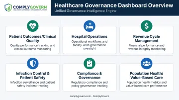
Patient Outcomes / Clinical Quality Dashboard
This dashboard tracks recovery rates, readmissions, and care-quality trends, giving clinical teams a real-time read on treatment effectiveness. It stands out because quality departments use it to pinpoint care gaps and build the evidence trail accrediting bodies expect to see.
| KPI | What It Measures |
|---|---|
| Readmission Rate | Unplanned returns within 30 days for a given condition. CMS risk-standardizes this by diagnosis and caps payment reductions at 3% for excess readmissions. |
| Average Length of Stay | Discharge days divided by discharges, benchmarked by diagnosis and payer to balance efficiency against safe discharge timing. |
| Patient Satisfaction Score | HCAHPS top-box, middle-box, and bottom-box results from a standardized post-discharge survey, tied directly to patient experience and public reputation. |
Hospital Operations Dashboard
Bed occupancy, patient flow, staffing levels, and discharge times all show up here, giving administrators a real-time picture of how smoothly the building runs. Operational leaders rely on it to reduce bottlenecks without sacrificing care quality.
Capacity pressure has intensified. Mean U.S. hospital occupancy rose from 63.9% between 2009-2019 to 75.3% between May 2023 and April 2024, edging closer to the 85% threshold experts cite as a bed-shortage warning sign (peer-reviewed analysis, 2025).
| KPI | What It Measures |
|---|---|
| Bed Occupancy Rate | Average hospitalized patients divided by average staffed beds, a direct capacity signal for administrators. |
| Average Discharge Time | How long it takes to move a patient from discharge order to actual bed release, a common throughput bottleneck. |
| Staff-to-Patient Ratio | Nursing coverage relative to patient volume, interpreted alongside acuity and workload rather than as a single fixed number. |
Revenue Cycle Management Dashboard
Finance teams use this dashboard to track billing, claims, and collections efficiency. Its real value lies in exposing cash-flow bottlenecks that threaten financial sustainability long before they surface on a balance sheet.
Denial rates matter more than most teams realize. MGMA reports an industry-average denial range of 5%-10%, with top-performing physician practices holding denials at 5% or below (MGMA, 2023).
| KPI | What It Measures |
|---|---|
| Claim Denial Rate | Initially denied claims divided by total claims submitted, tracked as an early warning of coding or eligibility issues. |
| Days in Accounts Receivable | Net patient A/R divided by average daily net patient-service revenue; MGMA's optimal range is 30-40 days. |
| Collection Rate | Net collections against expected reimbursement, with 95% as a minimum benchmark and 97%-99% considered optimal. |
Infection Control & Patient Safety Dashboard
Hospital-acquired infection rates and safety events land here, keeping care environments under continuous watch. Rather than relying on after-the-fact incident reports, it supports proactive infection management and cuts organizational liability risk.
| KPI | What It Measures |
|---|---|
| HAI Rate | Standardized Infection Ratio: observed infections divided by predicted infections against a 2015 national baseline. CDC reported a 9% drop in CLABSI and 10% drop in CAUTI in 2024 versus 2023. |
| Antibiotic Usage Rate | Standardized Antimicrobial Administration Ratio (SAAR); above 1.0 signals usage above predicted levels for that patient population. |
| Adverse Event / Near-Miss Rate | Unsafe events, including those caught before harm occurred. OIG found 25% of Medicare patients experienced harm during an October 2018 sample month, and hospitals failed to capture half of those events in their own reporting systems. |
Compliance & Governance Dashboard
Executives and boards get real-time visibility into regulatory readiness, accreditation status, policy compliance, and organizational risk through this dashboard. It replaces reactive, spreadsheet-based survey prep with continuous monitoring, eliminating the scramble in the weeks before a surveyor shows up.
This is exactly the gap platforms like ComplyGovern were built to close. Its executive dashboards unify governance, compliance, accreditation, and risk data into one live view, with role-specific dashboards for the CEO, COO, CMO, CNO, CQO, CCO, CIO, CRO, board members, and committee chairs, so each leader sees only what's relevant to the decisions they own.
| KPI | What It Measures |
|---|---|
| Open Corrective Actions | Unresolved CAPAs tied to incidents, findings, or audits, with effectiveness tracking to confirm the fix actually worked. |
| Policy Review Completion Rate | How many policies have completed scheduled review and approval on time versus how many are overdue. |
| Accreditation/Survey Readiness Score | A continuously updated readiness index mapped against standards from bodies like the Joint Commission, DNV, and AAAHC — replacing point-in-time survey prep with ongoing monitoring. |
Population Health / Value-Based Care Dashboard
Chronic disease management, care gaps, and cost trends across patient populations under value-based contracts all live in this dashboard. It helps organizations manage risk-based reimbursement and flag high-cost cohorts before costs spiral.
| KPI | What It Measures |
|---|---|
| PMPM Cost | Total expenditures divided by member-months of eligibility, the core unit economics of any risk contract. |
| Care Gap Closure Rate | Percentage of identified care gaps (screenings, follow-ups, chronic-condition checks) resolved within the measurement period. |
| High-Cost Patient Cohort % | Share of the population driving disproportionate spend. Nationally, the highest-spending 5% of patients account for nearly half of all healthcare expenditures. |
Essential Healthcare KPIs Every Organization Should Track
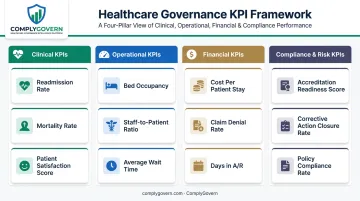
Beyond dashboard design, every organization needs a baseline KPI set that spans four functional areas.
Clinical KPIs
- Readmission rate — flags gaps in discharge planning and follow-up care
- Mortality rate — risk-standardized deaths within 30 days, adjusted for patient characteristics
- Patient satisfaction score — HCAHPS results that influence both reputation and reimbursement
Operational KPIs
- Bed occupancy — signals capacity strain before it becomes a crisis
- Staff-to-patient ratio — connects staffing decisions to care quality and burnout risk
- Average wait time — ED arrival-to-departure intervals that shape patient experience
Financial KPIs
- Cost per patient stay — a baseline for cost-control efforts (national average ran roughly $14,101 per stay in CDC's most recent published figure)
- Claim denial rate — early signal of billing or documentation breakdowns
- Days in A/R — how fast cash actually moves through the organization
Compliance & Risk KPIs
- Accreditation readiness score — continuous survey preparedness instead of a last-minute scramble
- Corrective action closure rate — how quickly identified problems actually get fixed
- Policy compliance rate — whether staff are actually following what's written down
Manually tracking these compliance metrics across spreadsheets is where most organizations lose time. ComplyGovern automates this layer specifically: its Governance Intelligence Engine links regulations, policies, controls, and evidence in one system. A single update, such as a new finding or a resolved corrective action, flows automatically to the relevant dashboard without anyone re-entering data.
How to Choose the Right Healthcare Dashboard for Your Organization
Common mistakes sink dashboard projects before they deliver value:
- Overloading dashboards with vanity metrics that look impressive but don't drive any decision
- Ignoring end-user needs — a 2024 scoping review found only 50% of published dashboards involved end users in the design process
- Treating setup as a one-time project instead of an ongoing, governed system that adapts as regulations change
When evaluating a dashboard platform, prioritize:
- Data integration across clinical, financial, and compliance systems, not another isolated tool
- Role-based customization so a CFO and a CNO see different views of the same underlying data
- Real-time refresh capability, especially for operational and compliance metrics that change daily
- Security certifications, including HIPAA-aligned architecture, role-based access control, and audit logging
Ongoing governance matters more than the initial build. Dashboards need to evolve as regulations, accreditation standards, and organizational priorities shift; a static dashboard becomes outdated within a year.
Conclusion
The right mix of dashboard types and KPIs turns scattered clinical, financial, and compliance data into decisions that actually move outcomes, efficiency, and audit-readiness forward.
Before adopting any solution, look past the visuals. Evaluate scalability, governance capability, and how deeply it integrates with the systems you already run.
ComplyGovern's live governance and compliance dashboards meet that standard, giving boards and executives real-time line of sight, from boardroom to bedside. The platform replaces the spreadsheet-driven compliance workload with continuous, automated readiness.
Frequently Asked Questions
What are dashboards in healthcare?
Healthcare dashboards are data visualization tools that consolidate clinical, operational, financial, or compliance metrics into one interactive view. They help teams make faster, better-informed decisions without digging through separate reports.
What are the 5 types of dashboards?
The five common types are clinical, operational, financial, compliance/governance, and strategic/executive dashboards. Each serves a different audience, from frontline clinicians to boards focused on long-term performance.
What are the 5 key performance indicators in healthcare?
Commonly tracked KPIs include readmission rate, average length of stay, patient satisfaction score, cost per patient, and claim denial rate. Together they cover clinical quality, efficiency, and financial health.
What is the difference between a healthcare dashboard and a scorecard?
Scorecards offer high-level, strategic, periodic views built for leadership planning cycles. Dashboards provide real-time, drill-down operational detail that frontline teams use daily.
How often should healthcare dashboards be updated?
It depends on the use case. Operational and compliance dashboards often need real-time or daily refresh, while strategic dashboards can update weekly or monthly without losing value.
Who uses healthcare dashboards within a healthcare organization?
Primary users include clinicians, department heads, finance teams, compliance officers, and executive leadership or boards. Each group needs a different slice of the same underlying data.